Crowthers Cake Studio, part of the Devonshire Bakery in Frodsham, are expanding their range of products and need an brand new online presence to promote their amazing range of cakes and cupcakes.


I was recently approached by Rebecca and Rob Crowther to redesign their sites and was very happy to take on this project for the well established family run local business. The three website design concepts you can see above are designed to show off the comprehensive range of wedding, birthday and celebration cakes on offer. I’ve used bright vibrant colours where possible to reflect the creative nature of the work carried out by Rebecca and her staff.
Below is a brief summary of each website design option which outlines the various features of each concept in more detail.
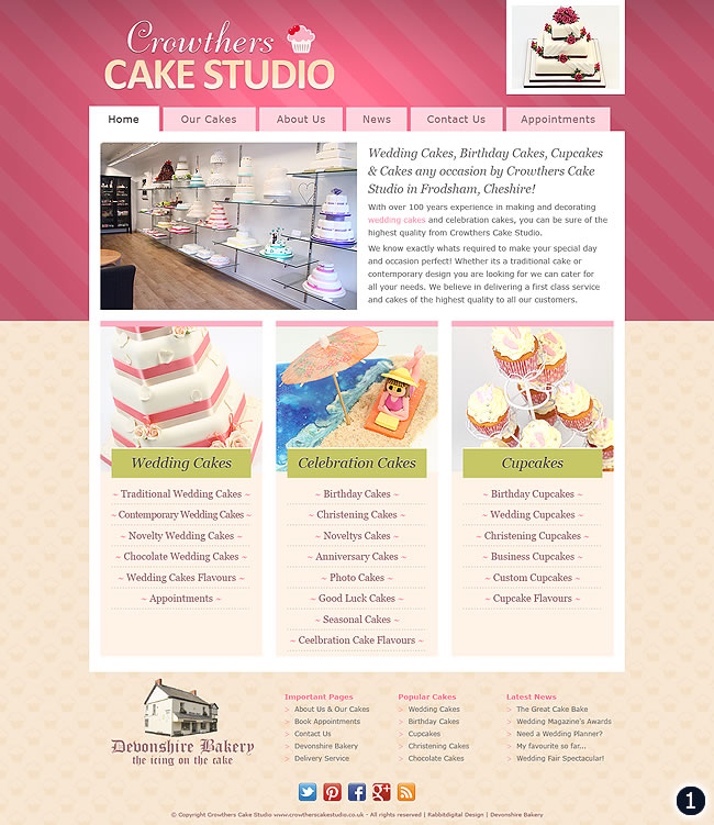
- Design Option 1 – A big bright background panel for the header with a logo design sporting a cupcake, image loop, tabbed navigation, studio shop and intro text occupy the top half of this design. The lower half holds three main category boxes with links through to all top product information pages. The footer design is clean and simple with a cupcake pattern background.
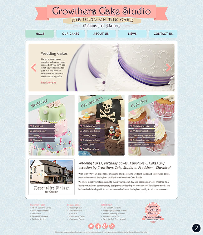
- Design Option 2 – With a ribbon effect banner logo, pale blue background and subtle navigation menu this is the most traditional design out of the three. The content area features an image slider at the top to promote various areas inside the website. Three category boxes with site links followed by some information about the site sits at the bottom of the content area. The footer here is also quite minimal and uncluttered with social media links and a rosette style logotype.
- Design Option 3 – Last but not least this is a slightly different format with a wider variety of colours etc. A pale green header, contemporary logotype, full width navigation menu and big bold image slider fill the upper part of the page. The three main category boxes are colour coded and show a fun selection of products on offer. The footer area of this design is again simple and clean featuring site wide links to all the most important pages.
Now that you’ve seen the three designs above and read a little about them please feel free to leave your comments in the box below, it will really help Rebecca, Rob and their colleagues in their final decision!

Number 2 is my first choice and then 1
Scrap 2,use header banner from 3 and studio photo from 1.replace first cake pic from 3 with first cake pic from 1
Much prefer no.3. – simple, clean, more contemporary & with a bit of character
Number 3 – very fresh and fun looking .. number 1 close second but I’d centre the name and get rid of the cake in the corner if i’m honest. Excellent work Warren 🙂
My favourite is number 1, I love the middle photo with the character on the beach
I prefer no. 1
Number 3, agree with previous comments looks more modern and inviting
I like number 3 but would get rid of the wedding cake picture and replace it with the wedding cake picture from number 1. Number 3 draws you in, it’s fresh, fun and interesting. Number 1 is a close second. Well done Warren.
Really like them all but prefer number 3 as it is a bit different to what you normally see for a cake shop
Being a keen Cake maker, i would prefer option 3
We like number 3 but think it needs to be made a little more mature with less cartoony images of the cakes. All look good but we agree with the comment from aim4life. Keep up the good work though!
Hey Woz
Number 1: for me this looks a bit like a blog layout..bit safe, doesnt really grab me as a viewer.
Number 2: much better layout…like the traditional banner header and the image slider at the top of the page. Nice colour scheme also
Number 3: The best of the 3 in my opinion – fresh, fun and modern design, great colour scheme, interesting to look at, good layout…..if i was looking for a cake studio and was browsing sites…this would be the one id stop on.
Fab work again Woz……
*wish id studied web design now*…:)
I like No.1. I prefer the font in the title. Although I should mention that I like the company name in pink in the main paragraph (as in number 3).
I consulted my 10 year old daughter & we both agree that it’s number 3 for us!
No.1, its clear and to the point. The other two are too busy!
The last one looks almost as if the shop is for children. Lots of pics of little figures and logo present a fun image though. There are slightly too many pictures for my taste.
I love the “icing on the cake” slogan on the second one. Not sure the blue goes with the other colours but then I am half colour blind. It is the least demographic specific of the three: the pink of the first one suggests a girls only feel. However, considering most of the customers will be women it is not surprising 🙂
Of the three, I probably like No. 1 best, pink aside. It’s clearly delineated in boxes and has the clear link the well known local brand of the Devonshire Bakery.
number one for me mate then two. Number one because it shows how proffessional the inside of the shop is and makes me think i would buy something from here.
I think it’s number 3 for me.
It’s nice and clear, and a bit more crisp than the first two for me.
I would say number 3. It is very clean and modern. I think it’s also inviting as I feel I would want to browse the site if I was greeted with that as a homepage. The colours make it also very eye catching and shows off the fun and creative side of cake making.
Very good ideas
Number 2 for me.
The second one 🙂
I love the logo and graphics on the third design – this is definitely my favorite overall design although there are parts of the other designs which I think work well.
I think you should use the tabbed browsing from the first design, it looks clear, slick and balanced.
I think the diagonal sub headings across the images on the second design works well as it improves prominence.
Using an image of the building adds kudos and will also act as a guide to anyone trying to find the store in person.
No 2, but that is a Southerner’s opinion. Says traditional, cakes and bespoke. Do i win a prize?
No one with the shop picture looks good the rest looks a bit clustered
no 1 – a neat formal approach – not convinced about the pink
no 2 – Too many fonts give a cluttered look
no 3 – modern and fun. I like the font at the top – as it looks like writing on a cake.
Id go for 1 if I was you, something about it makes me think cake the most, the third one is good as well, but the first one seems the best
Its between 1 and 3.
Although I like the fun aspect to 3, I also agree with others and would change the pictures a little, probably with the cake picture from 1.