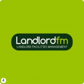
Here is a collection of logotype concepts for a brand new rented property maintenance company, Landlord FM, providing an all in one package of services for landlords and letting agencies.
The business aims to provide a comprehensive service for landlords and property agencies. Once a rented property has been vacated a team of technicians will carry out safety checks and cleaning. Gas and electric meters will examined by approved experts and extensive cleaning if the entire property will be carried out.
The full name of the business is Landlord Facilities Management Ltd so this needed to be shortened for the main part of the logo. Another aim was to include a simple graphic on each design to represent the services offered. The logo design basically needs to show the business provides a variety of different property services encapsulated into one comapny. I’ll explain each logotype in brief below although I’m sure you can work out for yourself what each is trying to achieve!
If you have time I also have a collection of similar projects for other clients that you might like browse in the logo design area of this site.
- Clean and contemporary, I’ve used Bauhaus medium here, in dark grey, bondi blue on a soft grey background with a simple house roof shape graphic on top.
- A bright crimson block containing the prime lettering, I’ve used Bauhaus again here but as you can see it looks just as good in uppercase.
- This has a similar format to number one utilizing a roof shape built with a series of triangles. The typeface here is Bliss regular, placed on a charcoal blue sandstone background. When shown on a white background you could change the lettering to a slate grey colour.
- With a myrtle green lozenge shape as the main element for this option I’ve gone for an eco Limerick green background. Comfortaa bold is the main font style used on this option.
- I wanted to try a more natural relaxed style for this option. A coquelicot flowing trail sits above the lettering to suggest that the company ensures everything runs smoothly and hassle free for you the client. Good old Swiss italic is my font of choice here or Helvetica for you traditionalists, one of my favorites.
- Using light crisp colours against a light grey background I’ve taken a more corporate approach with this concept. I know there isn’t anything to suggest property safety checks and cleaning here, I just thought I’d experiment. The letters FM for ‘facilities management’ placed inside this dark tangerine ellipse could represent many different things.
- Here I’m using an isometric cube built up with a series of connected triangles. Services grouped together under one roof is again suggested here. Colours used are Prussian blue for the lettering and center elements in the cube. VAG Rounded is the font which is quite a good all round typeface overall.
- A pyramid device forms the centerpiece of this visual made up with a series of interconnected cubes. You might think the pyramid looks like it could be the roof of a house which was intended.
- Finally I’ve chosen a vibrant tangelo orange background to accentuate the lettering on this logo design. Variants of Myriad Pro italic worked best for this option with the FM letters boxed inside a simple house icon.
Thats me done explaining myself now so over to you now for your thoughts and feedback on which one of these logos you think would be most suitable, you know the drill, leave a much appreciated comment below if you have a moment to spare please.


2 replies on “Landlord FM Logo Designs”
1 and 5 are my preferred choices, I like the colours, fonts and visuals of both. 3 is good too, I think the triangular structure gives a feel of maintenence and I also think the colours work really well. I prefer Bauhaus in lowercase than upper. 🙂 Hope this helps!
Number 4 for me, love the colour scheme, nice and bright and stands out well. Not sure about the FM at the end of any of them if I’m honest, reminds me of a radio station ..