Here are 9 logo design concepts I created for a brand new construction company based in the North West of England.
About the Business
Bryan Developments Ltd is a company headed by Robert Bryan, an expert in the construction industry. The business aims to specialise in all aspects of civil engineering. Key areas of work will include social housing, community living and helping vulnerable people with their housing needs.
The Design Brief
When Rob approached me with this project he gave me a general overview of the organisation. I was given full creative freedom with the colours and fonts which is always helpful. It can be quite difficult when you’re restricted to a particular colour scheme or graphic. The logo needed to express professionalism and efficiency which I’ve attempted to do with bold shapes and rich colours.
Overview of Each Individual Logo Design :
- Kicking things off with this design I started with a lower-case “b” and “d” in Comfortaa web font, made a triangular shape, rounded the corners, mixed the colours, yellow-green, asparagus-green, applied a slight drop shadow and hey presto.
- A more earthy colour scheme for this option, Josefin Sans is my font of choice, an amber semi circular device containing a burst of light behind an isometric graphic shape representing a multi-level building.
- Qwigley is my main typeface of choice with this logo design along with Questrial for the strap-line at the bottom. I chose a nice neutral #333 grey for the lettering and coquelicot orange ribbon or flag depending on your point of view, this is to symbolise fresh thinking and flexibility.
- A capital “B” is encircled and positioned above lower-case lettering in Muli italic font, using cherry red and white against a Bondi blue background. I’m quite pleased with the way this logo developed during the design process.
- Using three shades of green and white slightly arched lettering for the business name, this logo turned out exactly how I had visualised it during rough sketching. The row of buildings sit nicely on a gently arching horizon, typeface of choice for this one is Advent Pro, semi-bold and regular.
- Another play with the “b” and “d” lettering arrangement here and I finished up with a strong and vibrant option that I’m very happy with, it wasn’t all plain sailing though. Kreon bold and light is my font choice here with the building block device at the top in bright rust orange colour.
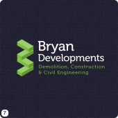
- I experimented with some isometric brick shapes here and attempted to create a capital “B”, you may or may not have noticed. Anyway, again, I’m very please with this particular iteration, white lettering in Museo contrast well with the yellow green I selected for the blocks.
- Simple and clear was the direction I headed in for this version. A version of Frutigar is the font with industrial brown and amaranth red, need I say any more!
- Finally, last but certainly not least after the time I spent perfecting the elliptical device, this is a good timeless example of a corporate, grown-up logo design. Very weights of Maven Pro is the font of choice with two shades of blue, a darked #154774 blue and lighter #35C7D8 almost cyan blue.
Well I hope you like what you have seen above, if you have got any comments, suggestions or feedback that could help Rob in his decision making then please leave a message in the comments box below.
I look forward to hearing from you all, thanks!


I like number 5 and 6. The colour on number 5 is striking and I like the building graphics. The use of the letters b and d to look like a building is a good idea.