
More people are using mobile and tablet devices when searching for local businesses and their services than ever before!
This is why Walmsley & Co asked me to design and build their new website to be responsive to different screen sizes. It needed to look just as good on a mobile smartphone as it does on a desktop computer or laptop.

There are so many websites offering local services to people and businesses these days that are still developed with only desktop screens in mind. While many look and function perfectly well on different browsers the user experience is more cumbersome on smaller hand held devices. This can put users off and send them elsewhere which is certainly not good for business. Over 58% of the UK population now use a smartphone and that figure is set to increase dramatically by 2016!
Across the UK and Ireland right now people are using their phones not just for apps and making calls but browsing websites too. As the graph on the right shows mobile web browsing is set to overtake desktop browsing by the end of 2013. This trend will inevitably continue upwards as network speeds increase and data plans get cheaper. If you want to promote your business or service online now and in future its vital your website can be easily viewed on multiple screen sizes. Even if you only want to display simple contact details and a brief overview of your business, your online presence needs to be mobile friendly.
About Walmsley & Co
Based in Winsford, right in the middle of our county of Cheshire, Walmsley & Co provide window cleaning services to commercial and residential customers alike. They have been trading since 1995 so a good twelve months before I started up Rabbitdigital Design. They operate more in the north of the country, in towns such as Frodsham, Helsby and Runcorn but are gradually expanding further afield. This is where their new website comes in. Already having a good reputation for providing a great quality service for a solid customer base they needed a way to shout about this to a wider audience.
Meeting with Walmsley & Co to discuss design & functionality
I first spoke with Matthew Walmsley in early 2012 about creating a new site for his business. He already had some ideas about how his new site might look and had seen some other websites he liked too. As his business provides cleaning services for domestic and commercial clients the new website needed to appeal to both sets of people.
When searching for local window cleaning companies, business people are most likely to be doing so on a desktop computer or laptop from an office, whereas private home owners are increasingly using their mobile phone or tablet. Each page therefore needs to accurately display the content for all key services whether the user was viewing on a large widescreen display or hand held mobile. It needs to be easy to navigate and appeal to corporate and public viewers.
Website design phase
Taking into account all the information we had discussed I began working on a visual for the new website. I used the home page desktop version as the starting point. Colours for the first draft, as you can see to the right,  where sky blue #00B2DE in the background and highlights with white and a cool grey #17515C for the text and main elements.
- Key design features :
- Clean fresh and professional design.
- Appeal to businesses and the public alike.
- Easy to navigate, find important information such as services offered and contact details quickly without fuss.
- Modern fonts, good quality images and bright colours.
Beginning at the top in the header with the main logo on the left and telephone contact details graphic floating to the right I worked my way down the page. The main navigation needed some careful consideration as I wanted to retain the buttons all the way through to the mobile size screens. For screen sizes up to 480px the buttons would split into two columns and from 481px and above would span the full width of the wrapper on one row.
I mixed up the grid in the content area between two columns for the text and three columns for the graphics. At the top of the home page an image slider occupies two columns with a box featuring important links to key services floating right in the third column. The main welcome H1 heading and two columns of text is next followed by a group of six link boxes spanning three columns on two rows. The page is finished off with two more columns of text and finally the footer area.

Above : The approved final desktop design with revised darker blue colour scheme

Development and template building phase
I used WordPress to develop the website as it offers the best all round features and flexibility. Once I had approval for the final visual I started to plan the structure of the template. Again working on the home page I decided to use <UL>‘s to house the main blocks of content. This would make it easier for Matt and his colleagues to update the content on the home page in the standard ‘Visual’ view without breaking the layout.
- Key template features :
- Self hosted WordPress CMS backend.
- Responsive, lightweight template theme.
- CSS media queries for layout control.
- Ubuntu Google Font for all text.
After installing the latest version of WordPress I installed my responsive base template. There is a rapidly expanding selection of responsive WordPress themes available nowadays if you don’t have the time to create your own. Next I spliced up the design elements and logo etc from my visual into png and jpg files and uploaded them using the Media tool in the Dashboard. I find this is the easiest way to organize all the graphics and apply the title and alt text for each image file. For certain images, such as the body background, I FTP upload them straight into the theme images directory, this keeps the image URLs nice and short in the CSS stylesheet.
Once all the graphics were loaded up I was able to concentrate on the theme layout. Beginning with the header area, always best to start at the top and work your way down, I used media queries to set the position of the logotype, telephone graphic and main menu. I used @media (max-width: 480px) for mobile screens, 768px for iPad, 992px for standard screen sizes and 1200px for the larger displays. CSS media queries are definitely the most reliable way to control layout and target screen sizes.
As I mentioned earlier, for the content area on the home page I used a series of unordered lists controlled with CSS classes. With the classes in the @media queries I was able to really control the layout, after all we designers are a ‘bunch of control freaks’ as they say!
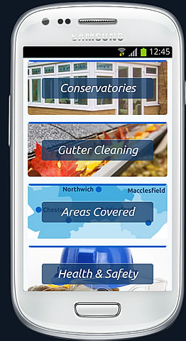
Using said queries I was able to fine tune the design of the main services link boxes in the middle of the page. As you can see in the image to the right, in the Android view-port, I reduced the height of the <li>‘s using classes and centred the ghosted blue <SPAN> title boxes in the middle of each block. I set float:none; in the classes inside the @media (max-width: 480px) for the services boxes to stack them up making them easier to read and select. For the transparent effect on the <SPAN> boxes I used background-color: rgba(24,64,107,0.75); with background-color: #2e6eb0\9; to degrade gracefully in older versions of Internet Explorer.
For the font I found a really great typeface at Google Fonts called ‘Utuntu’ which I embedded using the CSS option. Full instructions on how to code this in can be found on the website when you have chosen the font you want to use. Ubuntu has a good selection of weights including Book 300, Normal 400, Medium 500 and Bold 700 in both upright and italic options.
Before switching the new website on in the live space I had to do some browser testing. I used my Android and iOS devices for this along with IETester for Windows, which can be downloaded free, to fix any bugs in the CSS. If you don’t have access to all the devices, a great tool for testing your new responsive sites is The Responsinator where you can test on iPhone 3+4, iPhone 5, Android (Samsung Galaxy), older Android, iPad and Kindle view-ports.
If you would like to give some feedback then please do, use the comments below or contact me direct using the form on my contact page. All constructive criticism and comments are welcome, compliments are very welcome. You can view the finished site right here on any device you like. So go ahead, take a look and see what you think.
Thanks for reading 🙂