When Great Food Affairs asked me to design and develop a brand new website to promote their latest products I was delighted to be given the challenge and become part of the team!

The project began, when back in June 2014, Beege Bourne-Whittaker contacted me about creating a brand new online presence for Great Food Affairs. Beege is the managing director at the company and had a clear idea about the image she wanted to project to promote a range of newly launched products. To start things off I had a design meeting with Beege and her partner Keith Robinson. They explained the requirements of the new website, the products it would promote and the image of the company that they wished to portray.
Our first design meeting was a success and we all quickly discovered we were going to work really well together and make a great team. I went away from the meeting not only with plenty of notes and ideas but also a box of fantastic product samples! These included tubs of the famous Allioli garlic dip and a fantastic selection of Bruschetta and SLABS in all flavours. I don’t usually come away from my meetings with a free box of food, so this was great!
About Great Food Affairs
Okay before I start getting into the design project itself I’ll tell you a little bit about Great Food Affairs the business. The flagship products are Allioli, Bruschetta and SLABS which are manufactured and sold under the GFA brand. Based in Northwich, Cheshire, Great Food Affairs deal primarily with trade customers. However consumers are also able to buy their products online through the eCommerce part of the website that I have built.
The company was founded by Beege over 15 years ago and has gone from strength to strength since. Clients include Aldi Stores, B&M, Morrisons, Home Bargains and Farmfoods to name just a few. GFA also supplies top restaurant and gastro pub chains nationwide along with Ales by Mail the online beer retailer. GFA use their website and other design material that I have created to promote their fantastic products at trade shows up and down the country each year.
The Website Design Phase
I had a ton of real content to work with from the beginning which is always a good start. Too often I’m asked to mockup a website design with no real content which is always a difficult task. Not this time though, Beege sent a load of product images and text content to use on the designs. The photography was stunning and shot professionally by a specialist food photographer. I was fully inspired at this stage and confident I could come up with the goods for Great Food Affairs.
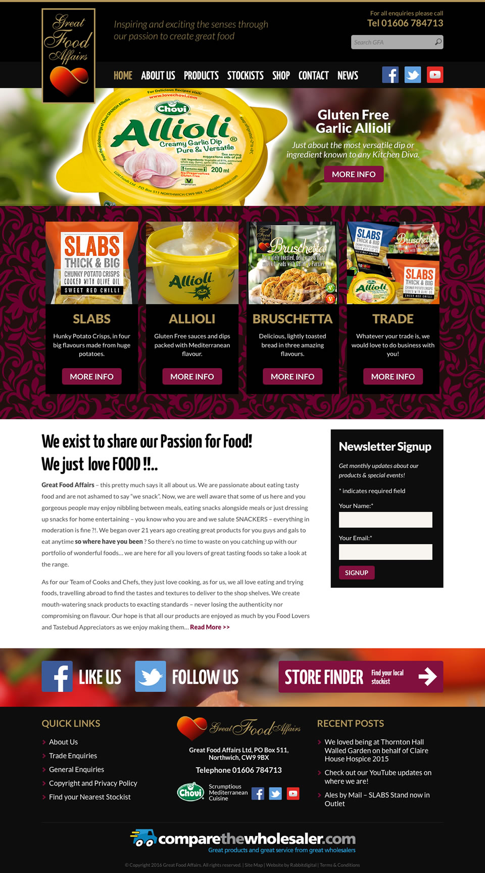
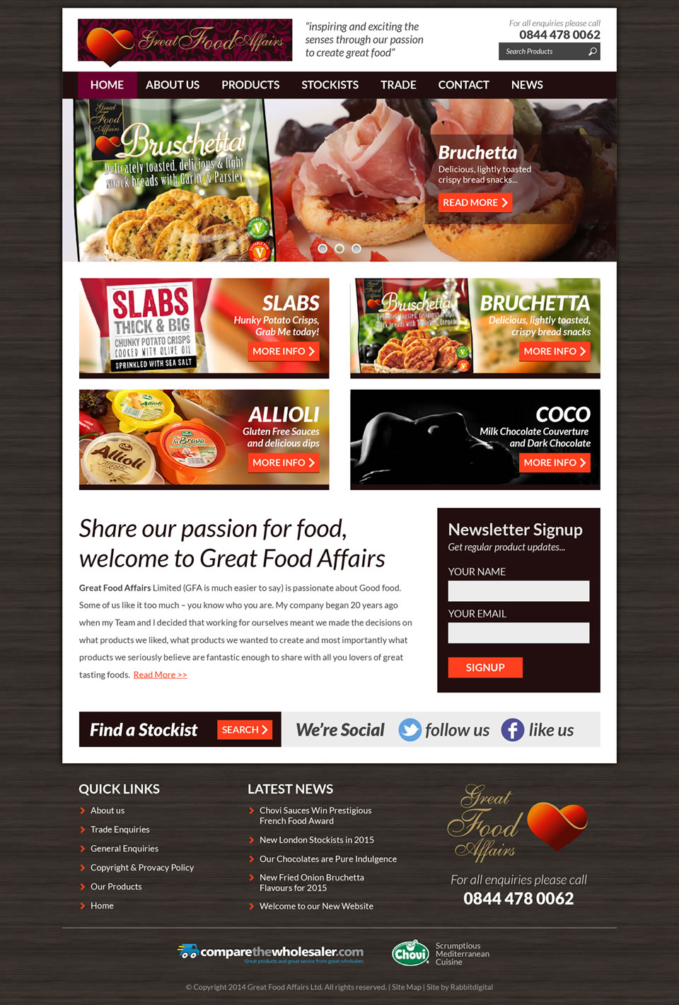
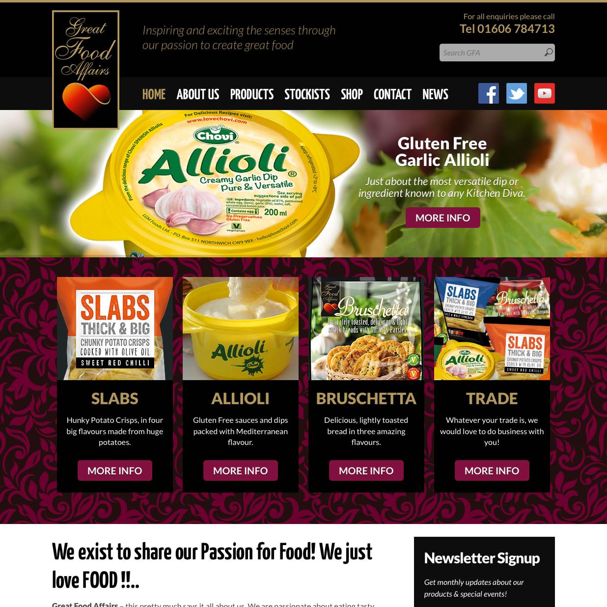
I’ll start off with the finished designs and work backwards to explain how and why I created them. As with many of my full website design projects I created three alternative design options. I tried to make these as unique and individual as I could. This method enables me and the client to test different ideas so we get a robust solid end product.
Design Comp – Option 1

Design Comp – Option 2

Design Comp – Option 3

Ideas, Sketches and Inspiration
As mentioned I was given a ton of stuff to work with from day one. Product photos, samples and branding designs galore. Beege and Keith, the main stakeholders in the project had worked really hard on the preparation for everything. I was even given a project specification in the form of a PPT document. This was handy to refer back to throughout the design and build phase.

I sketch quite a bit when exploring different ideas and inspiration. After a while the layouts start to flow and everything begins to fall into place. Sketching helps to clarify my ideas before I begin creating more refined website design comps. I keep to a simple line drawing initially but will usually visualize the colour way in my mind and make notes about these along the way.
I’ll also label other areas with suggestions for texture and background images. Yeah yeah I hear you saying “textures are sooo 2011” but I think they still work in the right setting. Ultimately my goal is always to create the best end product for my clients with the most impact. To that end I will use what ever necessary design style to get the best end result. I steer clear of design trends as a rule which allows me to create a bespoke end product.
Website Design Comprehensive Layouts
With sketching done and all ideas explored I moved on to the website design comps. This is the stage that brings clarity to the process and where everything starts to come together. I’m able to focus on the end result and apply meticulous attention to detail. From font sizes and colour hex’s to margins and image scaling, this is when each design really comes to life.
Design Comp Option 1
This was probably the closest, in the header area anyway, to the PPT speck supplied. I replicated the logo overlap of the main menu navigation and top of the banner slider. Beege had used solid black in her mock-up however I decided to try this with a softer grey tone. This however was rejected and the final design was presented with a solid black in the header areas and footer. As you can see it not a million miles away from what eventually went live. I completely agree with Beege with regard to the use of solid black in the design, it looks so much better.
Design Comp Option 2
A straight boxed layout was the format I settled with on this one. From the outset and sketching phase I decided I was going to offer up this layout as an option. It was received well by the GFA team but it was felt it wasn’t quite what they had in mind for the new site. I created a subtle dark shaded timber panel background in Photoshop which contrasted nicely with the solid white content area. I was simply trying to draw attention to the foreground elements but set a rustic tone at the same time.
Design Comp Option 3
For the third and final option I tried out a bit of a mix of the first two. The header and footer areas span the width of the viewport while the content area sits neatly inside a boxed, slightly ghosted panel. I used the landscape shape logo in the header again to keep the height down. The banner slider also spans the full width of the screen in a shallow letterbox shape. The main emphasis is again on the link blocks through to the product pages.
Website Development Phase
Having presented the design comps as links to view in the browser Beege provided feedback for each option. She requested a revision of option 1 which included elements from the other 2 designs. This was then approved and I was given the go ahead to start work on the development phase.
The new website began life initially as a part brochure site and part corporate. It also needed to feature a news blog so the obvious choice was WordPress, the UK version. The hosting is provided by Kualo so once I had the cPanel logins I began by installing the software. I used Espresso by MacRabbit for coding and was able to develop the new theme on the server due to the super fast FTP connection I was able to acheive thanks to Kualo.

CSS Styles
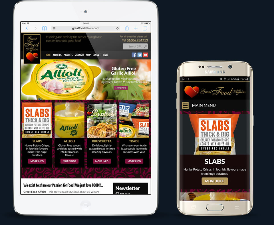
As with all my sites I try to keep the break points in the CSS media queries to a minimum. It can be difficult with complex layouts especially when you think of all the different screen sizes these days. With Great Food Affairs there are essentially three break points which I think isn’t too bad. The area of the site that features most in all three is the header. This is due mainly to the position of the logo relative to the main menu navigation. Other areas such as the blog and product pages benefited from CSS rules in all three media screens.
/* RESPONSIVE - Big Screens (iPad Landscape) */
@media screen and (max-width: 64em) {
}
/* RESPONSIVE - Medium Screens (iPad Portrait) */
@media screen and (max-width: 48em) {
}
/* RESPONSIVE - Small Screens (Mobiles) */
@media screen and (max-width: 37.5em) {
}
WordPress Plugins used on Great Food Affairs
Only one premium plugin was necessary to develop this site and that was Slider Revolution which I purchased over at CodeCanyon. Everything else I installed came from the WordPress plugin repository. For social sharing I installed AddToAny Share Buttons which is hands down the best plugin of its kind and easiest to use. Other functionality is achieved with Fast Secure Contact Form used for receiving customer messages.
I could go on and on I suppose but I think I’ll leave it at that for now. If you have any questions or would like to make any suggestions about this project please get in touch, it would be great to here from you!
Thanks folks!
