Cheshire based Nun House Veterinary Clinic provide professional care for their clients’ pets at their practice in Winsford and needed a brand new website to explain more about what they do.


I was approached by practice owner, Nigel Hough, and asked to come up with a selection of design concepts for a brand new website to promote his veterinary clinics in Cheshire and Staffordshire. I was very happy to be given the task and over time managed to research a number of veterinary practices and their services around the UK. Nigel wanted a website that he and his staff could easily update by themselves so I created three CMS website design options as you can see above.
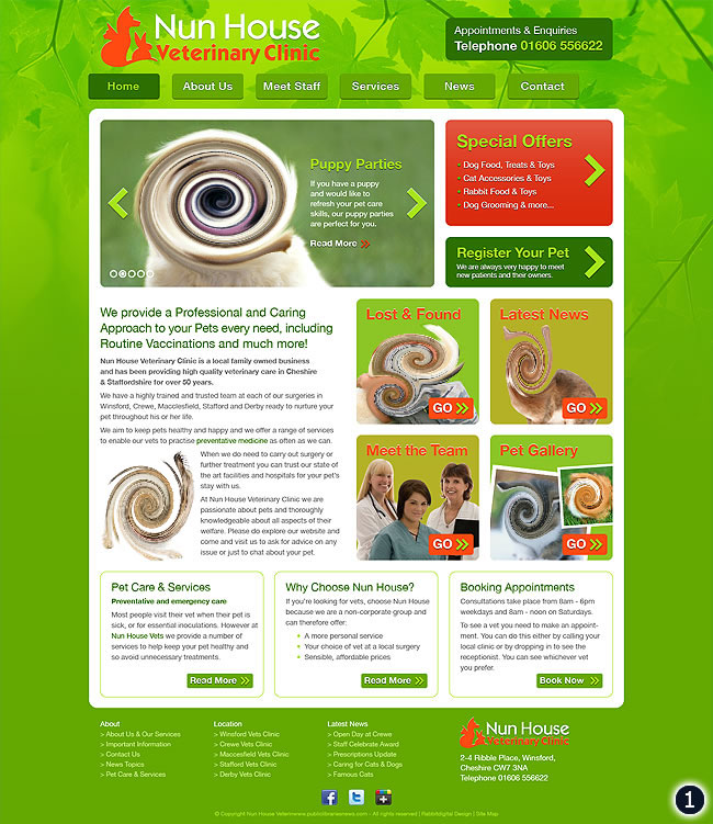
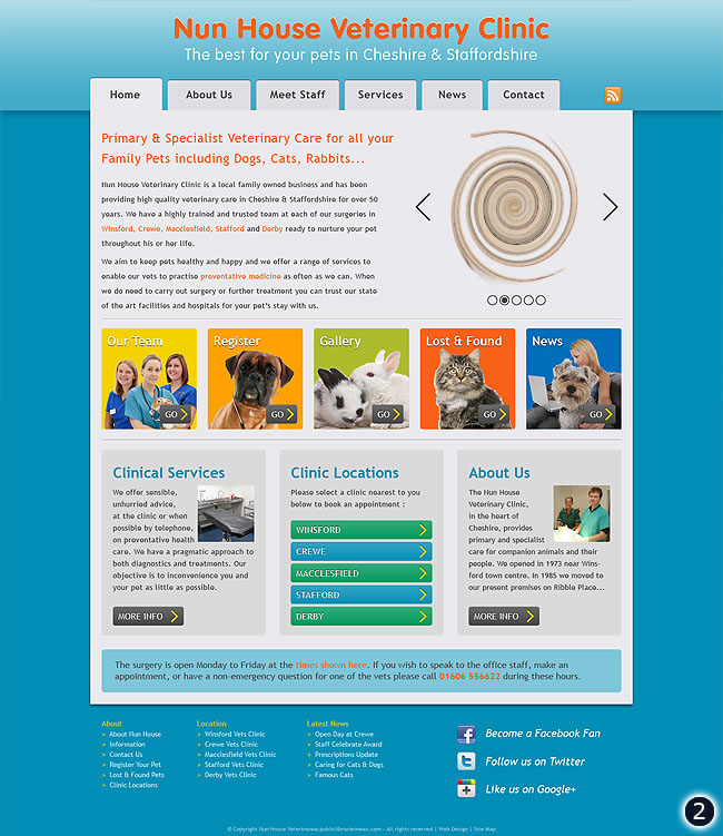
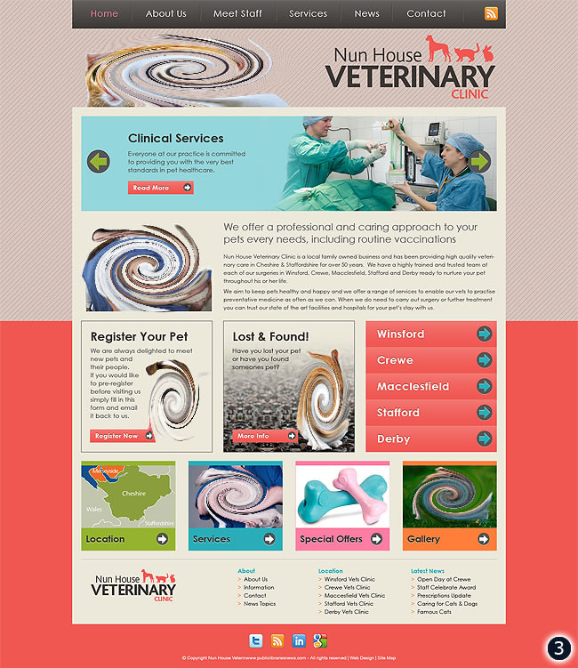
The use of bright, happy and fresh colours was requested to project a friendly approachable image for his clinics who mainly specialize in caring for Cats, Dogs and Rabbits. Clear call to action buttons promoting the different sections and services are also an important feature on all three designs. You can read an outline of each design concept below and then leave a comment if you like!
- Design 1 – A bright green background image with an organic look and feel. Modular organized box links to all the important sections and two third width image slider.
- Design 2 – Features a sky blue background, light grey content area, tabbed navigation and a selection of colour coded box links to relevant sections.
- Design 3 – More technically orientated with a split background, top of header navigation, full width promotion slider, introduction text and boxed areas to display links to all the important parts of the website.
Well, I do hope you like what you’ve see above, if so please tell us what you think using the comment box below. All feedback is welcome whether its positive of negative we really want to know your thoughts in either a couple of words or more detail if you like!
Thanks folks 🙂

13 replies on “Veterinary Clinic Website Design”
Love number one, very fresh and nice on the eye. Well done, 3 more excellent peices of work. Gary
I like number 2 best
I prefer design number 2 as its more medical looking, clinical if you know what I mean.
Xan 🙂
I’ll be different, I like number 3 closely followed by number 2 fab designs Warren (just like mine 🙂
Jules
I like the 1st one but i think number 3 looks more sophisticated, go with 1 though 🙂 x
We like them all really but number 1 and 3 stand out most, 1 is more fun and 3 is more sophisticated as Sarah says.
Thanks
Ann & the girls
number 3 for me!
My fav is number 3 as I like the colours used, but that is closely followed by 2 as my second choice
I like 1, but with a query about the red on green.
I prefer the look of number 1, its more inviting and friendly (altho that could be the dog photo), number 2 looks more like an information type site, number 3 is more professional, but i’d go with 1.
i liked the look of number 3 it stands out more and looks more professional.
I prefer number one, as its got a friendly, welcoming look to it, altho that could just be the dog photo! Number 2 looks more of an information-type site (like FAB etc), and number 3 looks more of a professional site (like NOAH etc). i’d definately go with number 1.
Hey Woz
Number 1 for me…easily the best. Its inviting, nice colours, well laid out…the most appealing of the three. Design 3 came in second….again good layout…wasnt that keen on the colour scheme though!!
Nice work once again x