New plant hire and recycling company, Franoli Ltd, are looking to promote themselves as a modern and forward thinking business who provide all aspects of dockside and construction site services from their base in Runcorn.
Robert Wilson, managing director of Franoli Ltd, decided he was in need of a different approach with his business image and contacted me in the hope that I would come up with some new ideas. A handful of other printed letterheads had already been tried and tested but Robert just wasn’t happy with what he was looking at! Robert was sure he didn’t like what he had seen up until now but at the same time he had no idea what he actually wanted. Having had a few discussions with Roberts colleague, Angela, I set about trying to create something contemporary and corporate with the only criteria being that he didn’t like the colour green and would like to avoid the use of yellow and navy blue if at all possible!
I have created 9 logo designs which you can see below all using a variety of colours and in different settings, some simple and conservative and a few slightly radical designs so please leave your comments about any that you’re drawn too and as always constructive criticism is welcome, thanks 🙂


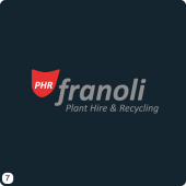
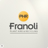
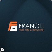
8 replies on “Franoli Cheshire Plant Hire & Recyling Logo Design Visuals”
I prefer 7 but a close second is 5!
2 for me, closely followed by 1.
My money’s on number 7, with number 8 being a close second .. well done mate
I’m liking number 7&8, like the black backgrounds
I like number 8 because it looks clear and bold which suits this type of business.
I like number 5 because I liek the star at the top
No. 2 for me, but 5 is close behind.
6 first nice and bold then 7.