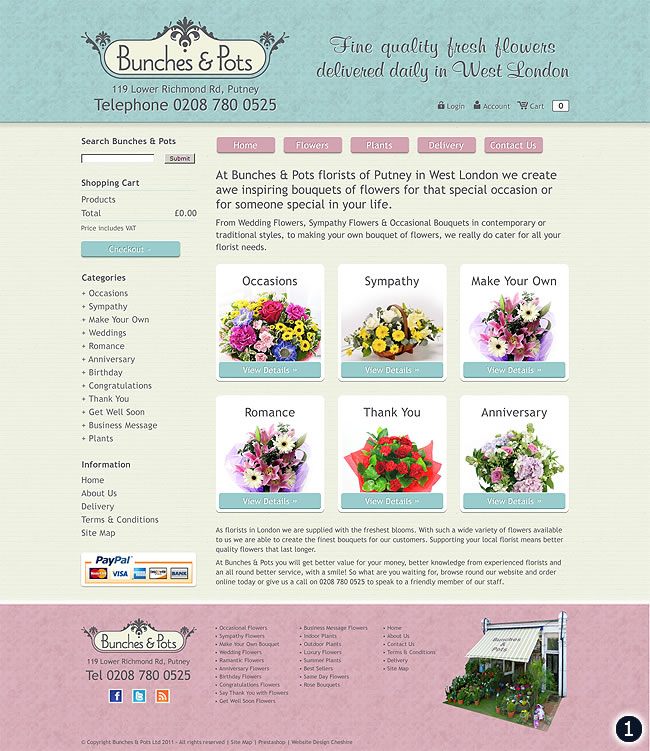
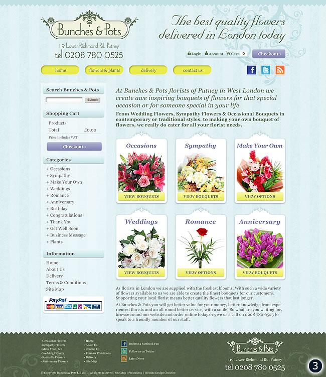
When Sam Raymond of Bunches & Pots in Putney approached me to design a new website for his West London flower & plant shop I was delighted to take on the project.


As you can see above I have tried to show Bunches & Pots florist in Putney as an elegant and well established flower and plant shop and hopefully the designs reflect this. After searching flower shop website design Sam came across Rabbitdigital and decided to contact me for his own website redevelopment. He explained that he already had a logo designed that he was very happy with and would like the new website to follow this style if possible whilst being clear, simplistic and easy to navigate at the same time.
The three website theme options above should be easy to navigate, give a clear message of what Bunches & Pots are about and showcase clearly the main bouquets on sale. I have used soft textures, mint greens, blues and turquoise pastel colours and featured variations of the colour pink which is after all a colour commonly associated with flowers & florists bouquets.

20 replies on “West London Flower Shop Website Design”
Number two for me
I like number 1, it just looks more inviting to the eye and easy to look at
number 3 kidda. X
Defo number 2. Charming and, well, floral.
Defiantly no 2 Wozza looks more colourfull and stands out better to sell the product
Defo no.2 for me, that would be the one that would by my lady flowers from!! :0))
My votes for number one mate but number three is a close second ..
Number 2 for me mate, good colours and manages to be businesslike while still being pretty enough for the flowers.
Number 2 without doubt!
I think number 2 is best
Defo number two for me, that’s the one that would encourage me to buy flowers for my lady!
number two mate they are bolder and bigger leaving more of an impression.
I definitely prefer number two as it is very crisp and clear. All the text is easily readable.
Number 2 defo. Should not have showed the wife have gotta go and get her some flowers tomorrow now cheers wozza ;-$
I like the colours in #1 but like the flowers /header on #2.
Number 3 for me. Best colour scheme. The thing I like about all three designs is that it makes it simple to select from the main 6 categories.
layout of 1st design with flower pics from 3rd.good luck woz.
Number two has a less sedate colour scheme than numbers one and three, which I find a little pedestrian on the eye. Love the menu options so you can choose appropriate flowers for the occasion. We chaps aren’t good at getting it right so that would be a big help.
Good luck with the website guys !
Haywood M
A big thank you to everyone who took time to review the designs above, Sam decided on #2 with a few slight adjustments!
Cheers folks 🙂
The new website is now live and open for business!