Winsford based D&D Coatings, specialist industrial painting contractors, contacted me with a view to rebranding their company profile, so we started with the logo…

About the Company
Officially known as D&D Industrial Coatings Ltd, the company has been trading successfully since the mid-1990’s. Specialising in services for commercial property they provide roof protection painting coating, gutter lining, cladding, corrosion prevention and floor slab coatings to name just a few. Pipe wrapping, tank and bund lining along with the application of protective and decorative paint coatings to all kinds of structures are also what the company provide to their clients on a regular basis.
The Design Brief
I had the pleasure of meeting the management of the business, Paul Drinkwater and Jayne Swinney recently to discuss their requirements. Paul and Jayne explained how the company was currently evolving and beginning to offer a more specialist service. With this in mind they decided it was time to rebrand and wanted a new company image to more accurately reflect what they do.
We discussed the current logo that has been used for the last two or three years and how the word ‘industrial’ was increasingly being omitted. Said Paul “Most of our clients simply refer to us now as D&D Coatings and hardly ever use the word industrial“. We discussed the types of companies and organisations D&D Coatings do business with and how they would like to be perceived. Paul explained he would prefer to see any logo design ideas against a lighter background but was otherwise generally open to ideas. Overall he gave me the freedom to go ahead and try a variety of different options, which was great. It can be quite difficult to come up with effective design solutions when working to numerous restrictions as I have had to do in the past.
About the Logos – the Design Process
So, following our meeting and after doing some research I had a fairly clear idea which direction to take. The wording would preferably be ‘D&D Coatings’ although at least two of the designs are featured without the ampersand. Because the logo will be used in a variety of settings it needed to be compact and clearly defined. The logo will be used online and offline, at small scale and large, from websites to brochures and business cards to van graphics. It had to be pretty versatile!
I’ve tried and represent paint coatings and other protective materials somehow using graphics. I also tried out a few ideas where the application process was demonstrated with simple ‘paint roller’ graphics. Please see the list below for a more detailed explanation of each logotype. I’ll try not to get too ‘airy fairy’ with the descriptions but can’t make any promises!
 Okay, to kick things off I started with this simple nod to the logo currently in use. Fonts are NJ TFL light and bold, colours are White #fff, Navy blue #2C4368 and Acid green #99CC33. Other than this theres not much else to say, I like the font, colours and simple compact shape. It would also be pretty versatile and work well in reverse.
 Here I decided to try and show the apex of a roof coated in a protective layer with a blue sky in the background. I’ve only used two colours, Sapphire blue #006C98 and Battleship gray #8D8173. The font is Inder regular and I’ve cut the stem off the cap ‘D’ letters.
 With this design I started off with the lettering, chose a suitable font then created the red disc shaped graphic to sit alongside. Inside the disc you will see two semi-circular shapes which represent layers of pretective paint and both (D’s) in the name. Colours are Rosso red #EC1C24 and Gunmetal grey #333333. The font is Asap Bold and Regular.
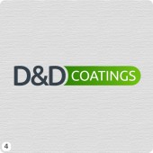 One of the few logos where the colour green features this is a minimalistic design option. Block capital letters for the D&D fit snug against a green gradient filled lozenge containing the word ‘coatings’. Font is Ubuntu Medium and Regular and the colours are Forest green #339900 and Deep green #36434C.
 Paint is often applied to large areas using a roller so here I demonstrated the process with a silhouette enclosed in a red disc shape. This sits above the initials also in red with the word coatings below. The font is Syncopate regular and the colours are Firebrick red #C22107 and Davy’s grey #555.
 With this design I started out with three roller shapes side-on with paint trails running off each one! After some chopping and changing I ended up using two of the shapes forming one graphic to represent both the initials (D&D) and rollers moving vertically applying red and blue paint. Sorry if I waffled on a bit there but I think you get my drift! Font is Asap bold, colours are Cerulean blue #336699, Coquelicot red #FF3300 and solid Black #000.
 Three diagonal strokes of orange paint are boxed in left of the main lettering, that’s it really, it is what it is and it looks great now after quite a few iterations! Colours are Coquelicot red #FF3300 and Imperial blue #004C72. The font is Oxygen bold.
 A thin protective layer sits on top of a rectangular shape, arched to represent a roof maybe with the lettering contained inside. Colours are Deep carmine pink #EC1C24, White #fff and Yale Blue #0C4C66. The font is Houschka-Medium.
 Here I created six tins of red, green and blue paint that sit to the left of the lettering. Red, green and blue (RGB) are how we humans perceive colour in the world so I figured this was a logical group of colours to use. The font is Source Sans Pro bold and semibold and the colours are, well, red green and blue with #333 dark grey.
 I started out with this one trying to show a roof panel side-on with a coating of paint stacked on top. It could be anything I suppose and I thought the colours worked well. Font is Maven Pro regular and black and the colours are Cobalt blue #342E62 and the Deep sky blue #009DBA.
 A simple lozenge with a protective layer on top representing a coating of paint. I thought a break from the lighter coloured backgrounds here would add interest to the collection. Font used is Raleway semibold and bold and the colours are Warm Yellow #FFCC00 and Dark Grey £222.
 Last but not least, I’ve removed the ampersand and replaced the (D’s) with two lines of paint forming letter ‘D’ shapes. Its as simple as that! The font is Maven Pro, the colours are Crimson Red #EF0643 and Light Cyan #19A3DD
It would be great to hear your feedback! If you have anything to say about the logo designs above then please use the comments box below so we can use this page as a single source of reference when reviewing the options. It will also make it easier for Paul and Jayne in the decision process.
Thanks for reading,
Cheers Warren 🙂
My favourite is number 12. I like the style of the lettering, however I think the letters need to look more like DD.
although they all look pretty good I prefer #1, #9 and #11 most
I like number 3, 5 and 10
I like no 9 its looks corporate ideal for this type of business
Number 4 or 7 for me, I think number 4 has the edge though.
Numbers 4 & 9 look the business. Maybe could do with the background being White though as per clients preference.
Great work Warren, for me it’s 3, 5, 7
Defo number 9 with no mods. Love it! The colours remind me of a old TV!
Number 6 looks too much like another brand, just can’t think which one.
number 6 for me warren, maybe try ‘ d+d ‘ in logo. I also like no.11.
No. 6 all the way for me. It looks very neat and clean, merging in the name with the function. I agree with the previous that looks a little like another local (is it David Beesley the Winsford electricians? It just rings a bell) logo but I could be wrong. I also really like really 12: I think it looks more contemporary and stylish … but, hey, that’s me all over 🙂
I really like No 2 I like contemporary and modern design