Helen Quinn, a specialist in ex-display and luxury used kitchens, contacted me recently with a view to creating a brand new logo for her new company, here are the first designs I created for here.

About the Business
From her base in the North West of England, Helen is in the business of buying and selling ex display and used high-end kitchens. If you have a good quality kitchen you are about to replace with a brand new one its better to sell it rather than simply through it away! That’s where Helen comes in, she will find a buyer for your old kitchen. Alternatively on the other hand Helen is able to source high quality kitchens, ready to install in your property, at a fraction of the price they would be from a kitchen retailer.
The Design Brief
I was therefore given the task of creating a logo that portrayed this somehow. The logo designs needed to project a professional and clean image. Teal or duck egg blue was favoured by Helen along with grey and brown. I tried to use these colours where possible in the options above but wasn’t as successful with brown. Sky and Tiffany blue work well as backgrounds creating a nice contrast with the sienna orange and charcoal grey I used on the fonts, graphic elements etc. I avoided the use of green as it could be misconstrued as Eco-friendly and is also a colour Helen preferred not to use.
The Fonts and Typefaces
I used only sans serif type faces as I felt serif fonts might not have worked with the whole idea of recycled and reused kitchens. Warm and friendly but sophisticated and classy at the same time, that was what I was aiming for. Picking the fonts took quite some time before I settled on the finished options you see above. Getting the balance right with the wording was also quite tricky. The first word “used” is quite a few characters shorter than the last word “exchange”. I majored or the word “Kitchen” on most of the designs as you can see.
The Logo Graphics
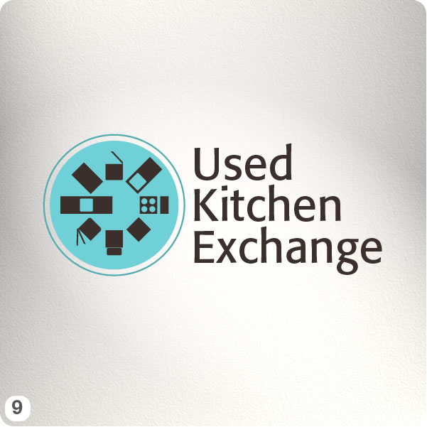
For the graphic elements, where used, I wanted to reference kitchen units, obviously, to help describe the business. Explaining how an old kitchen can be removed and lovingly reinstalled into a new home was quite a task. I reckon the design that does this best is probably #2, I’ll explain how in the details below. Appliances are part of the service provided too so I created a plan view of a series of common items such as a hob, fridge freezer, oven etc in design #9.
Here is a Brief Individual Outline of each Logo Design :
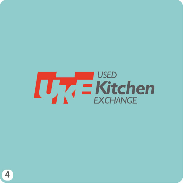
- One of the most straight forward options, I used a light “duck-egg blue” background with a rectangular charcoal grey panel containing the wording double stacked and in Avant Garde Gothic font.
- Three isometric shapes demonstrate the process of taking a kitchen already installed, dismantling it and reinstalling it in its new home. Again I’ve used a light sky blue background, light key-lines and Julius Sans One Regular for the lettering.
- I opted for a different approach with the wording arrangement, less format and semetric. Although I’m sure this won’t appeal to everyone’s tastes I think it shows movement and dynamism. Font used here is Ubuntu and is one of my favourites at the moment.
- Bold block letter initials reversed through tangerine offset panels sit to the left of the main wording. Again I just wanted to trying something slightly different to see how it worked. Font used here is plain old Gill Sans.
- One of only two options to feature ellipses as a main element, this is a simple layout with a recyle type device surrounding the inner ellipse. The typeface used here is Comfortaa light and bold.
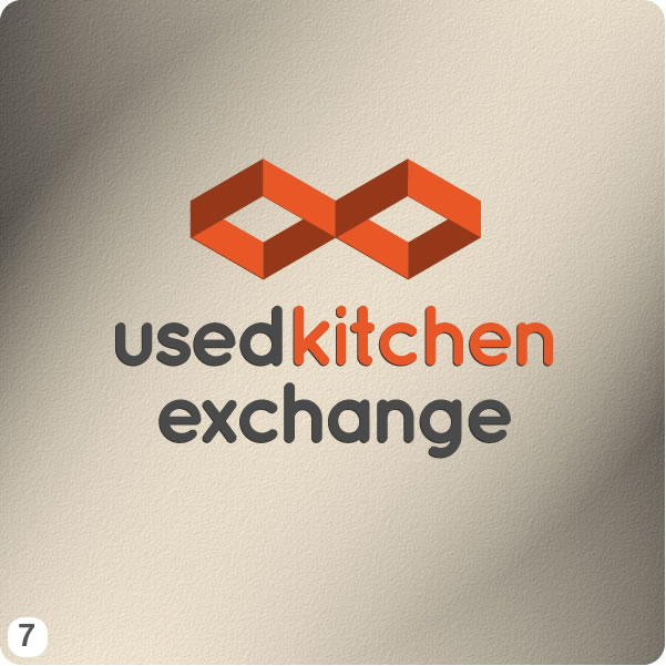
- Another simple, clean, clutter free design that I’m quite pleased with. It didn’t take long before I settled on the final layout with this logo design. The font, Frutiger, an old favourite of mine, works really well against the orange-red background.
- Some more experimenting with isometrics here, Quicksand is the font I used, a bit of photoshop lighting effects for the background and that’s it really, simple.
- Now this design, believe it or not, took a lot longer to finish than you might think. Yes I wanted a clean, almost “Next” like design but it took a fair bit of fine tuning to get the balance of the lettering just right. I’m proud of this one too, font used is Frutiger, again and the main container colour is a nice slate grey.
- Most definitely most fun to create out of all the designs this really explains everything in the Tiffany blue disk to the left of the lettering, at least I hope so! Click to zoom it and get a better look if you like. I refrained from adding any more detail than I have to the appliances, less is more as they say. The font I used here is Formata, not Frutiger!
So you will hopefully have had a good look at the designs above, and maybe read some of my waffle too! All I would like you to do now is leave a brief comment below if you have a moment. Constructive criticism is welcome and compliments, as always, are very welcome!
Number 2 and 5 for me .. love the graphic above the wording on number 2, really stands out and fits with the business name. Number 5 I like the colour scheme and the arrow representing recycling 🙂
This one is easy, number 9 all the way. Its really good, love the appliance images, although it might need a slight outlining boarder or something…….
number 9 is my chose although I do like number 6 as it is very current but think it might date.
it’s number 5 for me, stands out & looks really modern.
I think warren has listen to the brief and given me a lot to choose from! I like number 3 because it is on trend and up market looking. I got his reference to changing kitchens straight away and think he depicts this really well. Needs to be a little stronger though as I feel it is a little too soft/wishy washy. I hated number 3 when I first looked at it, but it has become one of my favs as the depth and movement he has managed to get into it is just brilliant. I am unsure however if it is right for me – opinions please. I also like number 8 for its crisp, bold professionalism. I think I favour number 2 best for its on trend, softer style – its laura ashley meets 2nd hand kitchens!! (sort of )
No 9 is the clear winner for me as it includes images of kitchen units whereas the others are more generic. I think you could also change the position of the larger unit at the 9 o’clock position to the 12 o’clock position so that it echoes the “on” symbol, with all sorts of positive (and electrical – so it includes the appliances in the symbolism) connotations.
You could also play with the “UK” initials of the first two words of Used Kitchen Exchange if the business ever expands nationwide, although I’d agree that it would be wrong to do so as yet.
Numbers 2 is my second fave as it’s a very modern look, although it does worry me that I get flashbacks to assembling Ikea furniture when I look at it.
I know some others like number 3 but it is too black for me, although I like the nod to the Olympic medals podium you have put into it, as well as it depicting actual kitchen units.
I think 5 is most suited to the nature/type of company. I would avoid the more corporate and vague logos such as 4, 7, and 6.
2 and 5 for me they stand out more, than the others.
love 3 cos it would be easy to deply in marketing materials and can e used efectively without coloyr. Also like 9, would take on board Ian’s comment of moving the appliance to 12 o’clock.
Good luck with the new venture 🙂
Hi Marissa, thanks for your comments. Interested in what you think….. how about if number 9 had the arrow around it like number 5? Would this work or is it too much? I liked number 2 – What are your comments on this one. thanks for your help x
i have put it onto face book and most people like 1, 2, 3 and 9……… ARRGGHH
I like number 2 best, followed by number 9.
Number 3 or number 9
I like number 3 and number 9. The images of kitchen units in the logo looks good. The font used in number 3 looks stylish.
I like number 2. The blocks look technical.
Haven’t got 1 particular fav. I’m liking 5,7 & 9
Number 5 or 7 for me. 5 is my first choice.
No. 9 is my favourite, followed closely by 8 and 2. Least favourite is 6 – I don’t dislike it but it reminds me of More Than Insurance wth the font and the use of I agree with Ian about No. connection with Ikea. Love everything about 9, the colours, fonts and icons. Hope this helps.
Number 9 for me cuz!