Sal Jones of Lollipops & Roses, a Warrington based wedding stationery designer, contacted me in September with a view to updating her current branding, here are nine new logo design options for you to view.
Specializing in creating unique handcrafted wedding invitations, thank you cards and more, Sal wanted to enhance her company image with a new look logotype and website to help promote her services. She provided me with a short list of similar companies offering wedding related goods and services to review. This helped guide me in the right direction and demonstrate Sals preferred style and image.
I’ve tried to keep the designs I created below as clean and multidisciplinary as possible while at the same time looking elegant and personal. I chose a variety of typefaces from traditional script to retro hand cut lettering styles. The colours I used in the background of each design along with the graphic elements and fonts are soft and feminine. Not to be too obvious I haven’t used a lollipop and rose graphic in all the designs either opting instead for decorative floral shapes. You can see I’ve taken a similar approach with my logo designs for Rebecca Holland who wanted to portray the same kind of high quality personal service to her clients.
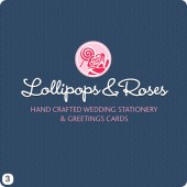
- For my first logo design I used Harrington font for the main wording with a light pastel colour scheme.
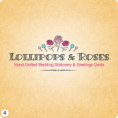
- I opted for an ‘Angel Delight’ pink background, a soldier course of lollies either side of a rose graphic and good old Big Caslon Medium for the main lettering set on slight ark.
- A lollipop and rose sit snugly inside a petal edged eclipse above the main lettering, all overlaying a navy blue background.
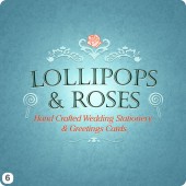
- This logo design is a nit more fun in its appearance, I used a row of graphics in a pyramid shape above the main lettering which is set in the fun font Bermuda LP Squiggle.
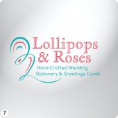
- I’ve gone for the elegant look with this option, a script typeface stacked up in four lines held together with a very fancy floral shape in pale blue.
- This was a tricky logo to illustrate, again the main lettering appears in two decks with decorative graphics, a rose and two lollipops.
- Believe it or not it took much longer to settle on the layout for this logo, the swirled shape to the left of the lettering evolved from an ‘R’ and ‘L’ and the colours where a bit tricky too.
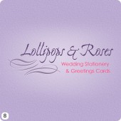
- I love the way the lilac textured background came out on this design and I’m quite pleased with the lettering as well.
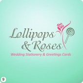
- Finally I used a different graphic for the rose here along with one of my favorite fonts at the moment, Isadora which works great in almost any setting and I’m really pleased with the mint green background.
You can click each logo above to zoom in for more detail so please leave your comments and opinions in the box below, all feedback is welcome!
Big thanks to you all 🙂



I’m drawn straight to number 6, like the font, background and colouring.
My favourite is number 6, I like the colours and the design is elegant. I am also drawn to number 3 and 9. I especially like the background on number 3.
# 6 is my favourite but also like #9
Hi Mr Warren, I hope is all good,
great design, fantastic way of giving your clients the choice of choosing….
I like option 3, is for him and her, lovely mix of blue and pink, classy but smart …and it works
But the client have last say….
I have not get the invoice for last months….please send me one before all the money go….
Take care Mr Warren
I like #2 and #6, I like the colours on #2, #5 and #8
I like #1, #3 and #6 best – if I was pushed i’d go for #3 as being my fave, i like the colours used here. Great company name by the way – you can’t help but smile when you say it!
Number 3 for me, caught my eye straight away!!
Hey Woz
Straight away No6 stands out..love the font and the subtle graphics surrounding it…works really well!!
I would also say no3 is a close second….really like the circle design above the lettering which would also work well as a logo element on its own!
Nice work as always xx