Crew Experience of Fulham & Putney offer exclusive barber shop & luxury male grooming treatments for their clients, owner Sam Raymond wanted a new website to reflect the high quality service provided by his West London salons and asked me to create three design concepts for you to view.


The salons are styled in warm colours, oak wood framed mirrors, flooring and doorways with tan and terracotta wall coverings feature throughout the interior giving clients a relaxed and comfortable atmosphere. I wanted to carry this through to the website designs and hopefully encourage potential clients to try Crew Experience for the first time. The home page also needed to promote special offers and events to existing clients and make booking an appointment or simple enquiry easy for everyone.
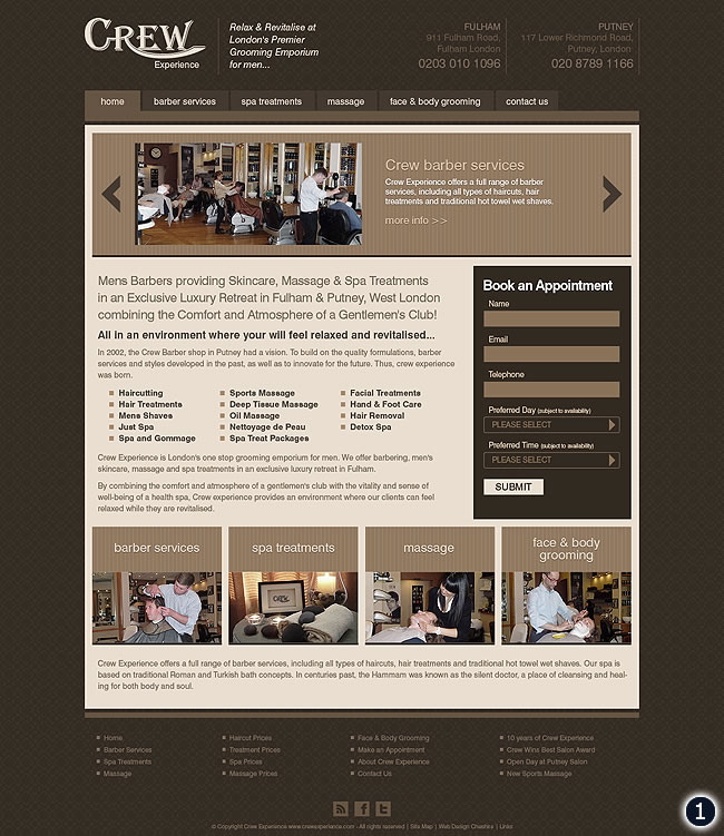
- Featuring an all over patterned background, salon contact details in the header, simplistic tabbed navigation menu, a boxed main content area with special offers and events slider, easy ‘Book an Appointmet’ box, four services boxes and a footer area with social media links etc.
- For this concept I wanted to flip the balance of #1, I’ve used a subtle light background pattern with everything overlay-ed. For the header I’ve centered the logo with salon contact details either side, the main slogan and then site navigation menu below, the content area again features a promotions slider, website text, a sidebar with the option to click through to book an appointment or simply make a quick enquiry, the main services boxes with monochrome images and footer area sit further down the home page.
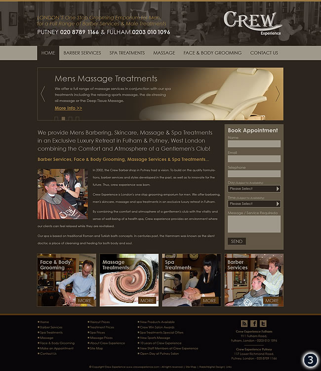
- Finally, last but not least, I’ve taken a slightly different approach with header and footer areas extending to the full browser width, there are no patterns or textures and I used a sans serif font style throughout with increased leading. However for the content area I have used a similar layout with the side bar ‘Book Appointment’ box and services boxes at the base finished off with a darkened footer panel with main site links, contact details and social media links.
Please leave a comment in the box below, your opinions and feedback will be much appreciated!

One reply on “London Barbers Website Design”
We like them all, they are some really nice designs but the one I would choose if I had to would be number 1, it looks like it might be the easiest to navigate and show off all the text and images best.