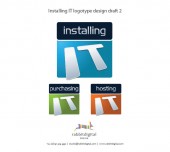
A fresh new image was needed for the InstallingIT brand and Rabbitdigital Design gladly took on the project.
Leo Hodgkins of InstallingIT needed a fresh new logotype design creating for his Cheshire based IT installation and support company and when searching logo design with Google he came across Rabbitdigital Design in Frodsham. InstallingIT pride their selves in providing high quality customer service to all their clients whether small or large. From their base in Runcorn, InstallingIT provide telephone support to businesses throughout Cheshire, including Warrington, Widnes & Ellesmere Port.
Once Leo and I had arranged a plan for the project I started work on the artwork for the new logos referring to a design brief supplied. Leo was looking for a more professional image to fit into a corporate setting as most of his clients are commercial businesses. He wanted a shape close to equal height and width which could be used in a variety of environments from printed matter and vehicle graphics to digital website and software branding. IT was required to form the main element of the logo so future variations could be created such as ‘HostingIT’ and ‘PurchasingIT’ all being part of an overall brand identity and family of logotypes.
With all the information I needed and with a little research into the IT business I began creating a selection of designs using various colour schemes, shapes and backgrounds to enhance the graphic elements on each of the logos. Eventually I ended up with 12 strong candidates to choose from which I’ve placed below, so please take a look for yourself and leave a comment in the box at the bottom, your email address won’t be publish but don’t forget to include your website, constructive criticism is very welcome and I look forward to hearing your thoughts.
See below the Final Design


5 replies on “Runcorn based InstallingIT new logo designs”
Theres 4 that stand out that in my opinion look the best and fit the brief right
1: Bold and striking logo, would suit the variation requirment well…not so keen on the pink colour though.
5: clean and simple..not as eye catching as the first but gives a professional and corporate feel.
6: Modern, cool and up to date…not really a corporate logo but very suited to an IT type company
10: again a very simple logo with a modern feel to it
Hope this helps
Frankie x
I like #9 best
My favorite is number 8, I also like 5 & 12
Bloody hell, Woz. Good work, they are all exceptional.
I like 1 best. It’s loud, big and striking, and also works better as a visual pun, just cos the word IT is more prominent.
Number 1 for president!
Number 1 for New Sky Sports anchor!
Number 1 is number one in my book!
X
[…] Nicola with my costs and examples of my logo design work for some of my other clients such as InsallingIT, Eurospace Resourcing, Runcorn based Halton Hygiene and MechTech WA in Perth, Australia, Nicola gave […]