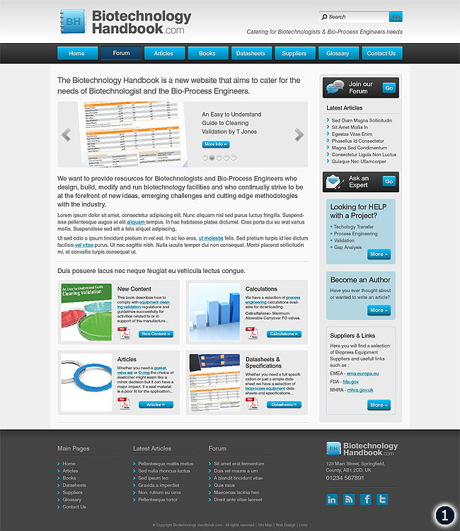
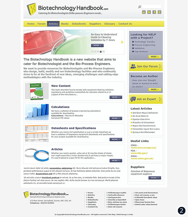
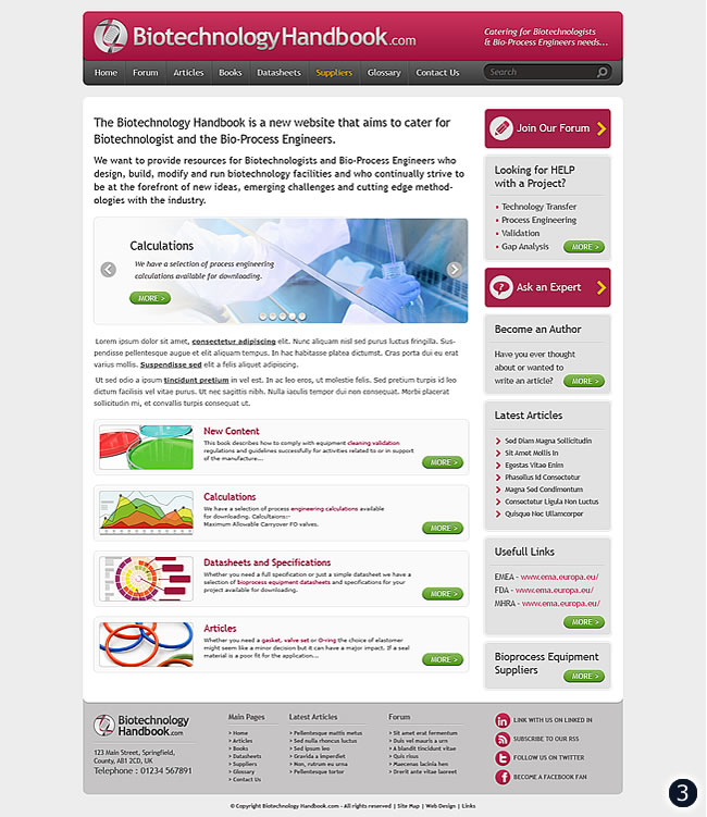
The Biotechnology Handbook is a new website which aims to cater for the needs of Bio-technologists and Bio-Process Engineers, here are 3 website design concepts.


Key aims of the project are to provide resources for Biotechnologists and Bio-Process Engineers who design, build, modify and run biotechnology facilities and who continually strive to be at the forefront of new ideas, emerging challenges and cutting edge methodologies within the industry. I have created clear and none-cluttered page layouts for all three website designs above and tried to keep primary colours to only three to four on each. For number 1 a cool sky blue and gunmetal grey colour scheme with full width navigation background and footer panels to hold in the content area works well. With number 2, pale yellow and light greys finished with a cool navy blue for button links etc draws attention to the main points of interest, I used a visual mock-up supplied as a reference for this layout. Finally for number 3 I took a slightly bolder approach with the colour scheme introducing maroon as the main colour for background elements, link objects, text and so on. Starting with a strong header, blocked sidebar with light tints used to build up the content area and slightly darker panel for the footer to finish off the page.
Please feel free to leave a comment in the box provided below to help us move the project onto the next stage with a majority vote for the favored design, thank you.
