A new CMS for H Roberts & Son Ltd who wanted to completely redesign their current website and also be able to upload products and services themselves!
The Liverpool based fire protection & safety company contacted me following a recommendation by one of my other clients. After a meeting with the company directors to discuss the sites requirements in detail I set about redesigning their website with a CMS format in mind. H Roberts & Son Ltd provide a wide variety of fire safety related services and products and have done for many years now since the company was established in 1907! The new website not only needed to be brought up to date visually but also needs to perform well with search engines and browser usability.
I have created three new design options below all reflecting the colour scheme currently used by the company. The fleet of vehicles are red with white lettering and the staff clothing is navy blue, black is also featured. Please take a look at the designs below and leave a comment in the box at the bottom of the page, thanks in advance for your feedback!


Number 2 catches my eye more
I like number 2 too!
I would say 2 3 then 1, number 2 stands out more but number 3 has a better main header.
I like 2 and 3 but prefer 3 as 2 has a bit too much red.
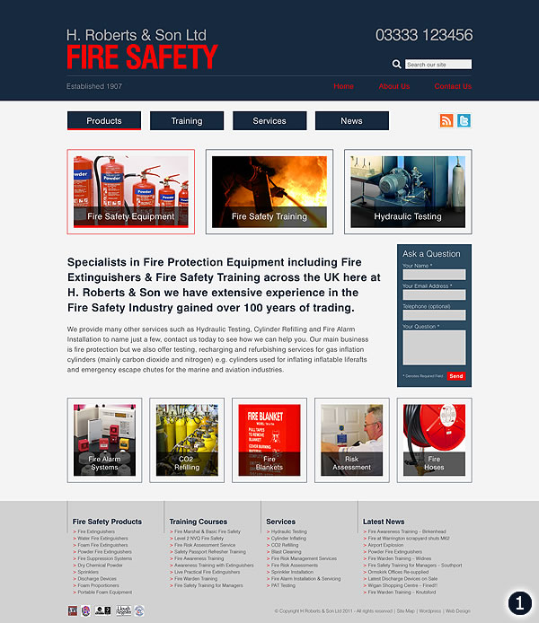
I like the first one, looks sharp and professional….
Number two
I prefer 2 but with the blue header background from 3 for better contrast
I like 1 and 2. i kept looking at what it was i didn’t like and its the word safety it sounds negative it should be protection.
Number 3 for me…
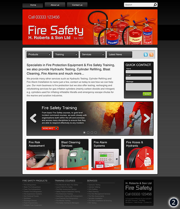
I definitely think number 2 is the best. Stands out the most while looking professional. It also fits well with the fire is red thought.
All excellent sites though, very crisp.
I’d have to say 2. It’s seems the most accessible and the easiest to figure out quickly what you want. They are all good but to give you a more critical analysis: 3 is my lest favourite as it isn’t eye catching and doesn’t seem as accessible as no.2. The problem with no.1 is that it is a bit plain and dated somehow. I hope this helps.
Much prefer the first one – the font and layout is my fave!
3 votes from us
3 ,2 than 1 from Gary
2, 3 than 1 from Becky
2, 3 than 1 from Tom
All look good but I think it needs photos of the workshop to show people what actually goes on with cylinders, blasting, extinguishers etc. A team photo with all vans in shot would be good to for the customer to put a face to the voice over the phone.
My favorite is number 3
number 2 looks good
I like number 3 then 1 then 2.
me and Dawn say 2!!! xxx
Number 3 !!! If not then number 2
Number 2 is what I would expect to see. The 1st one is lame and I don’t like the font on number 3. I think you need to add some professional images of the premises/fleet/team to give it some personality and encourage trust and familiarity. Also push the 100 years established fact and maybe get a stronger more identifiable logo!
Number 1 is the most professional and I think is more in line with your current image (if that makes sense).
Number 2 is the most eyecatching and is more up to date ( if that’s what you want)
Number 3 is also good but I don’t like ‘safety’ written in white.
Hope this helps
I prefer 3 best, then 2 then 1
In my opinion I like the clean looks of one followed by three and lastly 2 though three doesn’t look to have a “ask a ?” box that the other 2 have. In short number 1 would be my favourite aesthetically.
Number 3 with number 2 a close second … number 2 is a big red for this Evertonian!! lol … Congrats on some more quality work mate.
Number two for me with the boldness, number one a bit bland, number three is good aswell, but for me number two defo. Good work Woz.
Right number 1: the design for me is pretty flat, nothing exciting that pulls you in or makes you want to look at the site more. Its a safe design, and considering this is a relaunch of the site i think they would want more inpact than this design gives.
Number 2: Id say out of the 3 the overall layout of this one is the best, clean images, nice tab feature and visually appealing. I think my only negative with this design is the header……way too much red…the fire extinguishers are disappearing into the background……so perhaps change the background red colour to something darker?
Number 3: The header works alot better on this one with the blue background…..not that fussed on the main font though. The general layout is good…but doesnt have as much impact as design 2 has……
Id go with 2…but change the header colour…and you’ll be sorted!!!
Frankie xx
#2 for me. Its instantly eyecatching and the page is set out clearly and appears to be simple to navigate around the page.
I disagree with the others about the coulour of the header, i think its strong and bold.#
The page isn’t overly cluttered with too much text so it makes it easier to look at!!
I like nr 2 but think it would be better with the header from nr 3
Hi I prefer number 2, more eye catching.
I think the second one is best couz, It grabs my attention the most and is immediately obvious what its about with the images and strong red.