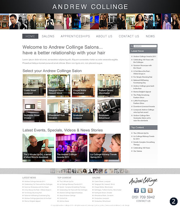
Below are three website home page designs for the new Andrew Collinge website soon to be launched!
Following a meeting with Andrew, Liz, Ruth and Jill to discuss future requirements for the andrewcollinge.com main website I’ve created three alternative design options to choose from. These are initially formatted for desktop browser display and once the preferred design has been selected I will create optimized versions based on the chosen layout for Smartphone and Tablet display including iPad, iPhone, Android and Blackberry devices. As many other Hair & Beauty Salons across the country choose very dark and bold colours it was felt that a light and minimalistic theme would be best to show off the elegant and sophisticated brand that is Andrew Collinge.
So take a look at the three designs below and either simply vote for 1, 2 or 3 using the comment box below or even better type a few words with your thoughts and opinion – your feedback is much appreciated – thanks!


I like number 2 best
Number 2 is more striking. Number 2 for king!
I agree, I would prefer too, looks easier to navigate.
sorry that was meant to be prefer number 2..lol
I really like them all but if I had to choose it would be between the bottom two. The top one could be seen as a wee bit corporate (although I like the nice clean approach so will understand if they go for that one).
I like number two – much nicer and brigher than the others but with number one you can tell its Andrew Collinge – its more their branding
Hey Woz……right my thoughts as follows:
Design 1: The white background is overpowering the whole page……theres such an array of links to view…yet nothing is standing out as the text is such a pale colour…..i like a website to grab me as soon as i view it…..this doesnt….Plus the top half of the site, which is the part that grabs a viewer is choc full of text and way too busy.
Design 2: The best of the 3……..nice header, not as busy with the text……easier to navigate….and gives an overall professional appearance, the contrast of the grey and white is just right in this one….really nice!!
Design 3: Alot better than the first one however this doesnt have the impact that the 2nd design has……
So go for 2…….its a stand out design!!
I like 3, but I think the header is a bit washed out – some colour may help
I am drawn to 2 and 3 ??? Maybe 2 more but all look ace.
I much prefer the bottom two as number one looks as bit pale and therefore uninteresting as im not drawn to it straigh away. I really like the bottom two designs as they seem to have more life to them, but my fav out of them both is number 2.
#2 for me Warren, i think the splash of colour stands out and i agree with Frankie that #1 looks like a corporate advert. I am used to being drawn to colourful adverts so the white background is unusal yet i don’t dislike it but do think the colour on #2 is definitely needed!
Hi Warren,
Number 2 def the best I really like the pictures on the top!
Hope that helps! x
Hiya Warren,not no keen on number 1,in my opinion number 2 looks good but a bit busy with all the pics, so for me it has to be number 3, hope this helps.
I like the header on nr 2 but the rest of Nr 3
I like number 2 best 1 is to pale i like 3 as well but over all i like 2 its brighter in colour n graps u straight away.Happy huntin xx
I think the second one is best, for the page design, though I prefer the banner of the first or third. And I actually prefer the look of the first ones buttons, more imaginative. Hope that helps
I like number 2 it stands out the most.
It was a tough call between 2 and 3 but I think 2 pops more and is an attention grabber. My vote is 2. Nice job!
Number 2 is my preferred option. The images at the top of the page convey professionalism and I like the splash of colour. The images inspire me to find out more.
However, I prefer the ‘Choose a salon near you’ section in option 3. It looks cleaner and less cluttered.
Nice designs all in all!
Hi Warren
Preferred no.2 – more colourful /attractive / interesting than the others. But I did like the larger ‘Andrew Collinge’ header on no. 1.
Number 2 sticks out for me.
I think number 2. Seems to be the most to do with hair and this comes across best in the second one. The first one, I wasn’t really sure what the website was about. The third one was better, but the second one gives the message straight away. The second one also looks the best.
Hi Wozzie
Yep it’s no. 2 for me as well.
No 1 is a bit “wishy washey”. Dare I say it but a bit boring.
No 3 is OK but doesn’t really stand out for me.
I love no. 2 because the pictures at the top are striking, modern, colourful, denotes fashion and style and draws you in. The most exciting for me.
I like No 2, It has warm colourful vibrancy. with bags of style, linked with fashion, very today. Definately number 2.